Brand manual
Design system #
Logotype #
-
White background, grey border
-
Green background, no border
-
Product placeholder
Official brand colors #
-
R 120
G 190
B 32Dr.Max green
#78BE20 -
R 228
G 1
B 44Dr.Max red
#E4012C -
R 240
G 240
B 240Dr.Max pale grey
#F0F0F0 -
R 220
G 220
B 220Dr.Max light grey
#DCDCDC -
R 167
G 168
B 170Dr.Max grey
#A7A8AA -
R 120
G 120
B 120Dr.Max dark grey
#787878 -
R 80
G 80
B 80Dr.Max state grey
#505050
Web and mobile complementary colors #
-
R 255
G 255
B 255White
#FFFFFF -
R 250
G 250
B 250Chalk white
#FBFBFB -
R 0
G 0
B 0Black
#000000 -
R 225
G 240
B 205Light green
#E1F0CD -
R 75
G 170
B 40Green
#4BAA28 -
R 60
G 140
B 30Dark green
#3C911E -
R 225
G 235
B 245Light blue
#E1EBF5 -
R 0
G 120
B 190Hyperlink blue
#0078BE -
R 255
G 225
B 220Light red
#FFE1DC -
R 175
G 0
B 35Dark red
#AF0023
Icons #
-
3za2
-
Chat
-
Success, ok
-
Chevron
-
Close, nok
-
Download
-
Pharmacy
-
1+1
-
3 za 2
-
5+25
-
Advisory
-
Alert
-
Asteriks
-
Bag
-
Basket-goods
-
Basket
-
Mobile
-
Tel
-
Mail
-
Maintenance
-
Minus
-
Plus
-
E-prescription
-
Coupon
-
Discount
-
External
-
Eye
-
Facebook
-
Favorite
-
Gift-simple
-
Gift
-
Github
-
Hamburger
-
Heart-empty
-
Heart
-
Help
-
Info
-
Link
-
Location
-
Lock
-
Loyalty-card-empty
-
Loyalty-card
-
Drmax-baby
-
Drmax-dermo
-
Dermo-consultant
-
Dermo-measurement
-
Drmax-dia
-
Drmax-veterina
-
Pharmacy-cross-hi
-
Pharmacy-cross
-
Pharmacy
-
Print
-
Question
-
Search
-
Security
-
Sort
-
Specify
-
Star-empty
-
Star
-
News
-
Transport-free
-
Transport
-
Trash
-
User
-
Zoom
-
Chevron left
-
Clock
-
Nok
-
Ok
Map pins #
-

Pharmacy
-

Selected pharmacy
-

Closed or unavailable pharmacy
Icon can change its color based on color css property from css or one of our theme colors.
You can add so many icons, you need. Be careful in adding new icons! Icons are pasted to web as inline svg and its code become the part of page html. Icons svg code should be cleaned before pasting on web.
- not to have IDs => may cause in page break with duplicit IDs
- not to have <?xml ?>
- should have fill="currentColor" attribute
You can edit svg code manually or use this project grunt develop or grunt build option, to clean up svg automatically.
Example of clean svg icon
Marketing specifics #
-
Discount label
-
Gift-simple label
-
3 for price of 2 label
-
1 plus 1 in adition label
-
Free delivery shipping
-
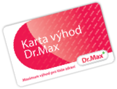
Loyalty card
-

Loyalty card render
-

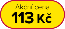
Action price discount
-
Nonprofit brand
-

The best brand award
-
- Discount -10%

Product tags
-
Dr.Max Dermo (beauty)
-
Dr.Max DIA
-
Dr.Max Baby
Fonts #
| Tag | Font family | Font weight | Font size | Line height |
| H1 | Proxima Nova | Medium | 33px | 133% |
| H2 | Proxima Nova | Regular | 22px | 133% |
| H3 | Proxima Nova | Regular | 18px | 133% |
| H4 | Proxima Nova | Regular | 16px | 133% |
| H5 | Proxima Nova | Regular | 14px | 133% |
| H6 | Proxima Nova | Regular | 12px | 133% |
| Lead | Proxima Nova | Regular | 20px | 133% |
| Default | Proxima Nova | Regular | 15px | 133% |
| Small | Proxima Nova | Regular | 12px | 133% |
Proxima Nova light (300) Proxima Nova regular (400) Proxima Nova medium (500) Proxima Nova semibold (600) Proxima Nova bold (700)
Default font-weight is 300-light and font-size is 15px.
Communication #
Tone of voice is a central part of Dr.Max’s customer experience, reflecting our brand personality and the value we place on good customer relationships. Here are a few simple rules to follow when writing copy for Dr.Max communications:
Be straightforward
Straightforward means plain-spoken, direct and clearly-signposted. Avoiding jargon and long-windedness. Ruthlessly paring down our communications, so every word counts. (But taking care not to lose our humanity in the process).
Be warm and reassuring
We value each customer as an individual and are personally invested in their wellbeing. The tone needs to emphasize care, concern and approachability whilst reminding customers that they are in the safe hands of our team of experts.
Our copy should reflect our commitment to the health and wellbeing of our customers. In order to achieve this, our copy needs to express optimism and reassurance whilst making every customer feel confident that we are focused on meeting their needs.
Writing Dr.Max in copy
When writing Dr.Max in copy it should always be in title case without a space between Dr. and Max. So Dr.Max NOT Dr. Max or Dr Max.