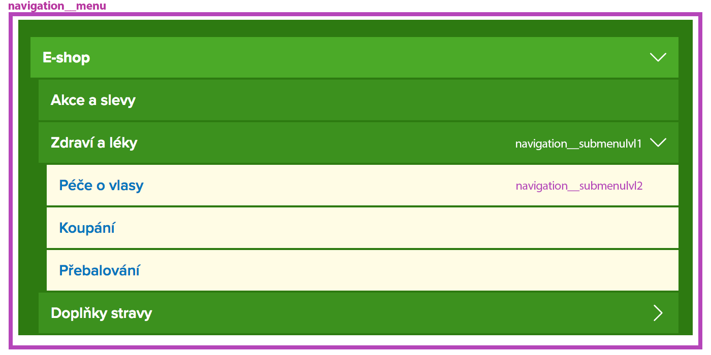
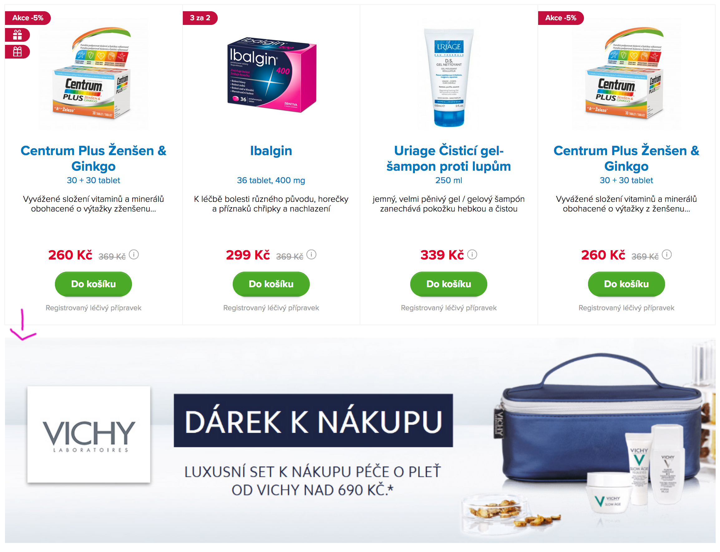
If this structure will not be keeped, page can break down.
The only exception is .carousel-hp component used in homepage. Where
carousel is out of container.
The reason of this is because of flex-column css property. On each .section should be .order-{0-12}
class presented.
Sections will be showed as in code ordering, if any section contains order-{0-12} class attribute.
Or section with same order-{0-12} is presented
Benefits of this solution are pulling SEO important content to top, and other less important content down. Let
me show example:
We will see in browser as:
- breadcrumb
- product listing
- seo test
Gaps between sections are controlled by bootstrap
spacing utility. Because of flex-column property margin adds up. So try to margin it only for bottom side.
All grid features are avaliable from Bootstrap documentation
here.
Responsive breakpoints are bootstrap's default.
Responsive versions are scaled with vw and rem units
If you styling something, you should style only BS breakpoints {xs|sm|md|lg|xl} and not to care about any else
resolutions. All other resolutions will be
scaled.
device sizes
style in
scaling to and develop in
0 - 575
no breakpoint
360 version
576 - 767
media-breakpoint-up(sm)
576 version
768 - 991
media-breakpoint-up(md)
768 version
992 - 1199
media-breakpoint-up(lg)
1200 version
1200+
media-breakpoint-up(xl)
no scaling
The only condition to make it work is convert all units to REM. Use my devstack with gruntfile (done
automatically in build mode) or use postcss-pxtorem
in your one.
Remove the default list-style and left margin on list items (immediate children only).
This only applies to immediate children list items, meaning you will need to add the
class <ul class="list-unstyled"> for any nested lists as well.
Lorem ipsum dolor sit amet
Consectetur adipiscing elit
Phasellus iaculis neque
Purus sodales ultricies
Vestibulum laoreet porttitor sem
Ac tristique libero volutpat at
Faucibus porta lacus fringilla vel
Aenean sit amet erat nunc
Eget porttitor lorem
Lorem ipsum dolor sit amet
Phasellus iaculis neque
Ac tristique libero volutpat at
Eget porttitor lorem
Lists should be styled to not break page flow. If you want to just add some typography text, use .text
wrapper.
The .btn classes are designed to be used with the <button> element.
However, you can also use these classes on <a> or
<input> elements (though some browsers may apply
a slightly different rendering).
In need of a button, but not the hefty background colors they bring? Replace the default modifier
classes with the .btn-outline-* ones to remove all background images and colors on any button.
Most of images are responsive = they have srcset & sizes
attributes. Because lazyloading is used, this attributes have data-
prefix.
Image html example:
Please always work with dist folder if you are implementing html code. Images in dev folder are
not responsive and have no some attributes. All the required attributes are added to images while build task and saved in dist folder.
Lazyloading works based on intersection observer functionality. This means our images are loading only if they are
visible in user viewport and they are not hidden (tab, window or other hidden content).
I recommend to use imgix image library. It's paid solution but has very much
usefull functions. It also can convert images to webp format wich can perform to more page speed and recommended
by
google.
I recommend to use absolute path for images. Because if it's relative microdata validator has errors.
Most of images use css property object-fit wich is supported
in all modern browsers, but IE does not support this. Because of this they are polyfilled with js objectFitImages(imgEl).
If you will be loading some content with javascript after dom ready state you should take care of this
polyfilling.
All components listed below are token from bootstrap and you will find it's documentation in official
bootstrap web. Components which bootstrap offers but not listed here are not used.
Dropdowns are toggleable, contextual overlays for displaying lists of links and more.
They’re made interactive with the included Bootstrap dropdown JavaScript plugin. They’re
toggled by clicking, not by hovering; this is an intentional design decision.
Dropdowns are built on a third party library, Popper.js which provides dynamic positioning
and viewport detection. Be sure to include popper.min.js before Bootstrap’s JavaScript or
use bootstrap.bundle.min.js / bootstrap.bundle.js which contains Popper.js. Popper.js isn’t
used to position dropdowns in navbars though as dynamic positioning isn’t required.
If you’re building our JavaScript from source, it requires util.js.
Wrap a series of buttons with .btn in .btn-group.
Add on optional JavaScript radio and checkbox style behavior with our buttons plugin.
Ensure correct role and provide a label
In order for assistive technologies (such as screen readers) to convey that a series
of buttons is grouped, an appropriate role attribute needs to be provided.
For button groups, this would be role="group", while toolbars should have
a role="toolbar".
In addition, groups and toolbars should be given an explicit label, as most assistive technologies will
otherwise not announce them, despite the presence of the correct role attribute. In the examples provided
here, we use aria-label, but alternatives such as
aria-labelledby can also be used.
Easily extend form controls by adding text, buttons, or button groups
on either side of textual inputs, custom selects, and custom file inputs.
Basic example
Place one add-on or button on either side of an input. You may also place one on both
sides of an input. Remember to place <label> s outside the input group.
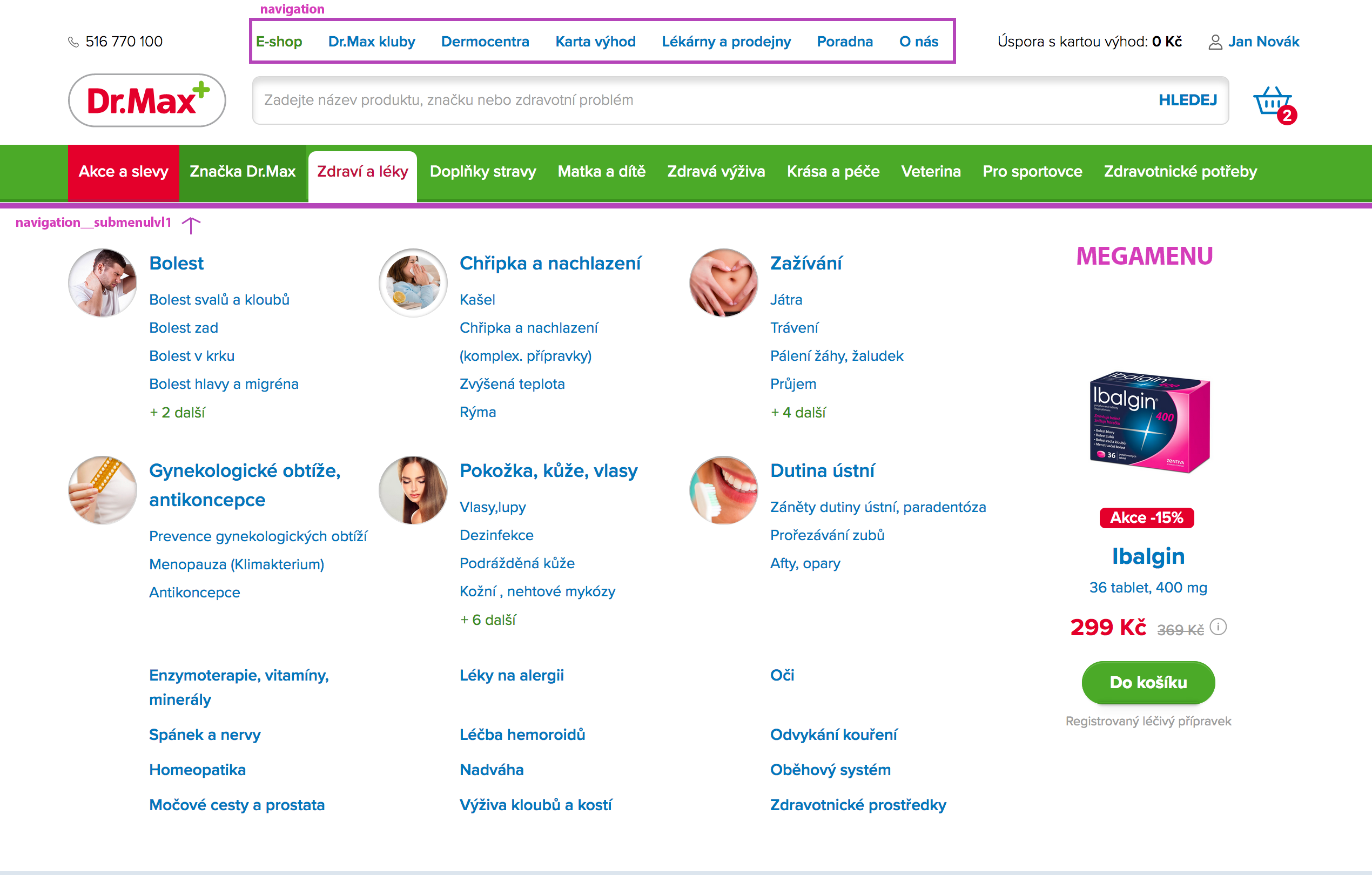
Navigation available in Bootstrap share general markup and styles, from the base
.nav class to the active and disabled states.
Swap modifier classes to switch between each style.
The base .nav component is built with flexbox and provide a strong foundation for building
all types of navigation components. It includes some style overrides (for working with lists),
some link padding for larger hit areas, and basic disabled styling.
The base .nav component does not include any .active state.
The following examples include the class, mainly to demonstrate that this particular class does not trigger any special styling.
Indicate the current page’s location within a navigational hierarchy that automatically adds separators via CSS.
Accessibility
Since breadcrumbs provide a navigation, it’s a good idea to add a meaningful label such as
aria-label="breadcrumb" to describe the type of navigation provided in the
<nav> element, as well as applying an
aria-current="page" to the last item of the set to indicate that it represents the current page.
Documentation and examples for showing pagination to indicate a series of related content exists across multiple pages.
Disabled and active states
Pagination links are customizable for different circumstances. Use .disabled for links
that appear un-clickable and .active to indicate the current page.
Pagination has 2 types:
- long type - most page uses this one
- short type - used in some pages inside devided page to columns. For example hr listing page. Useful when you need to break pagination earlier.
Provide contextual feedback messages for typical user actions with the handful of available and flexible alert messages.
Alerts are available for any length of text, as well as an optional dismiss button.
For proper styling, use one of the eight required contextual classes (e.g., .alert-success).
For inline dismissal, use the alerts jQuery plugin.
Use Bootstrap’s JavaScript modal plugin to add dialogs to your site for lightboxes,
user notifications, or completely custom content.
Modals are built with HTML, CSS, and JavaScript. They’re positioned over everything else in the document
and remove scroll from the <body> so that modal content scrolls instead.
Clicking on the modal “backdrop” will automatically close the modal.
Bootstrap only supports one modal window at a time. Nested modals aren’t supported as we
believe them to be poor user experiences.
Modal-header-secondary haven't background and moving the "close" button more up.
Tooltips rely on the 3rd party library Popper.js for positioning.
You must include popper.min.js
before bootstrap.js or use bootstrap.bundle.min.js / bootstrap.bundle.js
which contains Popper.js in order for tooltips to work!
If you’re building our JavaScript from source, it requires util.js.
Tooltips are opt-in for performance reasons, so you must initialize them yourself.
Tooltips with zero-length titles are never displayed.
Bootstrap “spinners” can be used to show the loading state in your projects.
They’re built only with HTML and CSS, meaning you don’t need any JavaScript
to create them. You will, however, need some custom JavaScript to toggle their
visibility. Their appearance, alignment, and sizing can be easily customized
with our amazing utility classes.
For accessibility purposes, each loader here includes
role="status" and a nested
<span class="sr-only">Loading...</span>.
Colors
The border spinner uses currentColor for its
border-color, meaning you can customize the color
with text color utilities. You can use any of our text color utilities on the standard spinner.
All utilities listed below are token from bootstrap and you will find it's documentation in official
bootstrap web. Utilities which bootstrap offers but not listed here are not used.
Change the value of the display property
with our responsive display utility classes. We purposely support only a subset of all possible values
or display. Classes can be combined for various effects as you need.
Value for display:
block, none, inline, inline-block, table, table-cell, table-row, flex, inline-flex
Enable flex behaviors
Apply display utilities to create a flexbox container and transform
direct children elements into flex items. Flex containers and items are able to be modified further
with additional flex properties.
We can use different combinations of classes.
<div class="d-none d-md-flex d-lg-inline-flex p-2 bg-blue-watercolor">I'm a flexbox container!</div>
Responsive variations also exist for display
flex and
inline-flex.
.d-flex
.d-sm-flex
.d-md-flex
.d-lg-flex
.d-xl-flex
.d-inline-flex
.d-sm-inline-flex
.d-md-inline-flex
.d-lg-inline-flex
.d-xl-inline-flex
Flex-direction: ROW
Set the direction of flex items in a flex container with direction utilities.
In most cases you can omit the horizontal class here as the browser default is
row. However, you may encounter situations
where you needed to explicitly set this value (like responsive layouts).
Use .flex-row to set a horizontal direction
(the browser default), or .flex-row-reverse
to start the horizontal direction from the opposite side.
Flex item 1
Flex item 2
Flex item 3
Flex item 1
Flex item 2
Flex item 3
Responsive variations also exist for flex-direction
row and
row-reverse.
.flex-row
.flex-sm-row
.flex-md-row
.flex-lg-row
.flex-xl-row
.flex-row-reverse
.flex-sm-row-reverse
.flex-md-row-reverse
.flex-lg-row-reverse
.flex-xl-row-reverse
Flex-direction: COLUMN
Use .flex-column to set a vertical direction, or
.flex-column-reverse to start the vertical direction from the opposite side.
Flex item 1
Flex item 2
Flex item 3
Flex item 1
Flex item 2
Flex item 3
Responsive variations also exist for flex-direction
column and
column-reverse.
.flex-column
.flex-sm-column
.flex-md-column
.flex-lg-column
.flex-xl-column
.flex-column-reverse
.flex-sm-column-reverse
.flex-md-column-reverse
.flex-lg-column-reverse
.flex-xl-column-reverse
Flex / Justify content
Use justify-content utilities on flexbox containers to change the
alignment of flex items on the main axis (the x-axis to start, y-axis if
flex-direction: column). Choose from
start (browser default),
end, center, between, or around.
Flex item 1
Flex item 2
Flex item 3
Flex item 1
Flex item 2
Flex item 3
Flex item 1
Flex item 2
Flex item 3
Flex item 1
Flex item 2
Flex item 3
Flex item 1
Flex item 2
Flex item 3
Responsive variations also exist for justify-content
start/end and
center/between.
.justify-content-start
.justify-content-sm-start
.justify-content-md-start
.justify-content-lg-start
.justify-content-xl-start
.justify-content-end
.justify-content-sm-end
.justify-content-md-end
.justify-content-lg-end
.justify-content-xl-end
.justify-content-between
.justify-content-sm-between
.justify-content-md-between
.justify-content-lg-between
.justify-content-xl-between
.justify-content-around
.justify-content-sm-around
.justify-content-md-around
.justify-content-lg-around
.justify-content-xl-around
Flex / Align items
Use align-items utilities on flexbox containers to change
the alignment of flex items on the cross axis (the y-axis to start, x-axis if
flex-direction: column). Choose from
start, end, center, baseline, or
stretch (browser default).
Flex item 1
Flex item 2
Flex item 3
Flex item 1
Flex item 2
Flex item 3
Flex item 1
Flex item 2
Flex item 3
Flex item 1
Flex item 2
Flex item 3
Flex item 1
Flex item 2
Flex item 3
Responsive variations also exist for align-items
start/end/center and
baseline/stretch.
Width and height utilities are generated from the $sizes
Sass map in _variables.scss. Includes support for
25%, 50%, 75%, 100%, and auto
by default. Modify those values as you need to generate different utilities here.
Assign responsive-friendly margin or padding
values to an element or a subset of its sides with shorthand classes. Includes support for individual properties,
all properties, and vertical and horizontal properties. Classes are built from a default Sass map ranging from
.25rem to 3rem.
Spacing utilities that apply to all breakpoints, from xs to xl,
have no breakpoint abbreviation in them. This is because those classes are applied from min-width: 0
and up, and thus are not bound by a media query. The remaining breakpoints, however, do include a breakpoint abbreviation.
Avaliable spacers listed below:
Where property is one of:
m - for classes that set margin
p - for classes that set padding
Where sides is one of:
t - for classes that set margin-top or padding-top
b - for classes that set margin-bottom or padding-bottom
l - for classes that set margin-left or padding-left
r - for classes that set margin-right or padding-right
x - for classes that set both *-left and *-right
y - for classes that set both *-top and *-bottom
When we can use margin or padding on all 4 sides of the element (m-$spacers, p-$spacers) > (m-2, p-4).
Here are some representative examples of these classes:
Horizontal centering
Additionally, Bootstrap also includes an .mx-auto class for horizontally
centering fixed-width block level content—that is, content that has
display: block and a width
set—by setting the horizontal margins to auto.
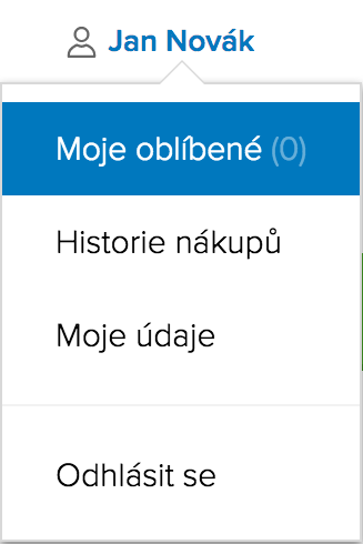
The "account-menu" component was created is used to customize css styles.
Is situated in header.
"account-menu" component is embedded in the "popover".
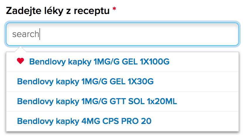
Acetylcystein Dr.Max 600 mg, šumivé tablety se užívají při akutních onemocněních dýchacích cest doprovázených
tvorbou vazkého hlenu a obtížným vykašláváním u dospívajících od 14 let a dospělých.
Registrovaný léčivý přípravek
Acetylcystein Dr.Max 600 mg, šumivé tablety se užívají při akutních onemocněních dýcha…
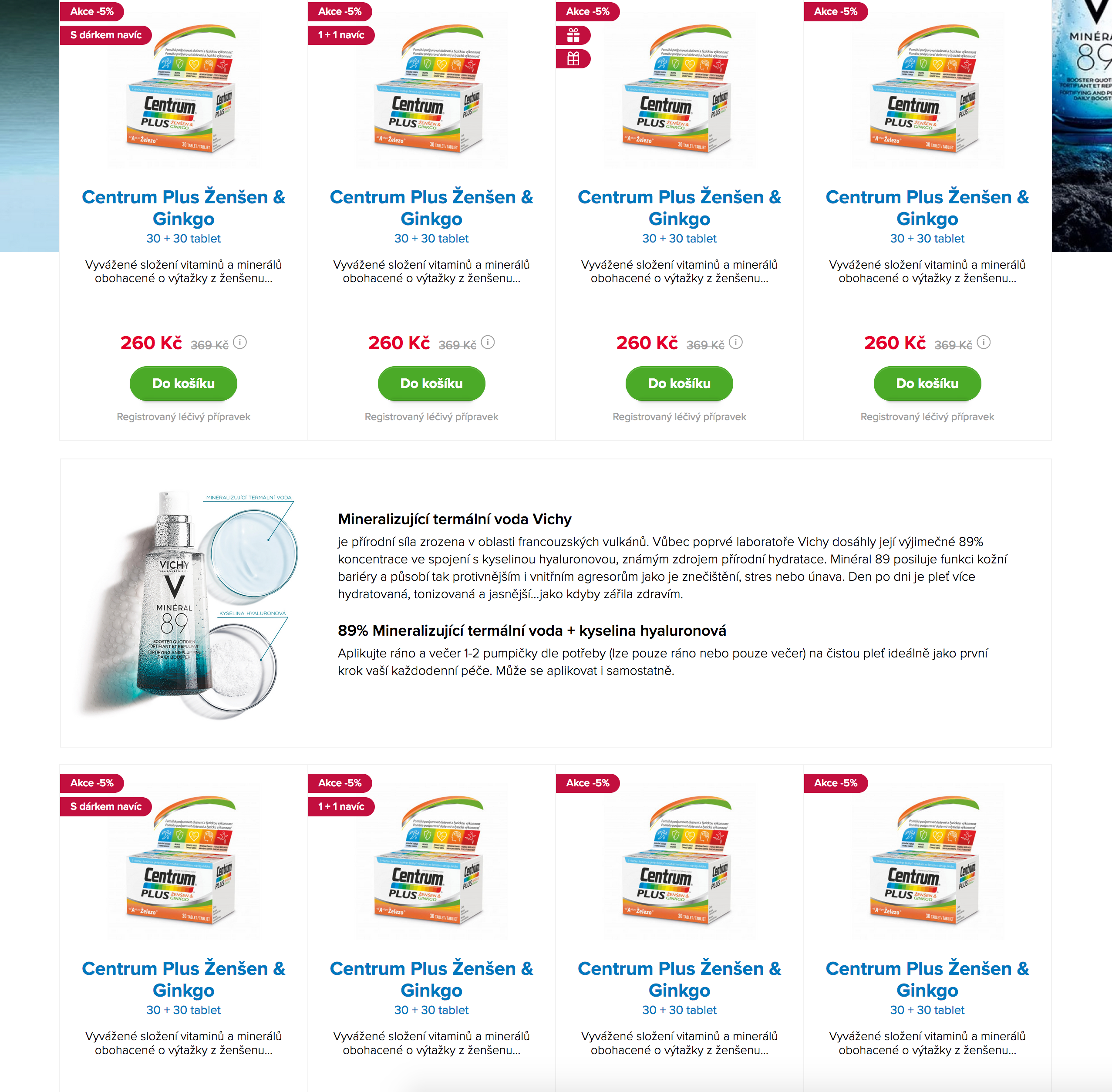
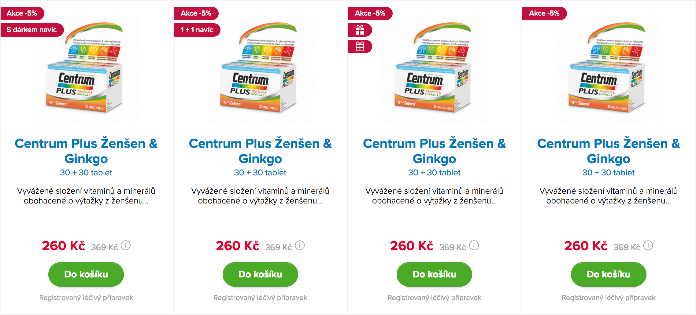
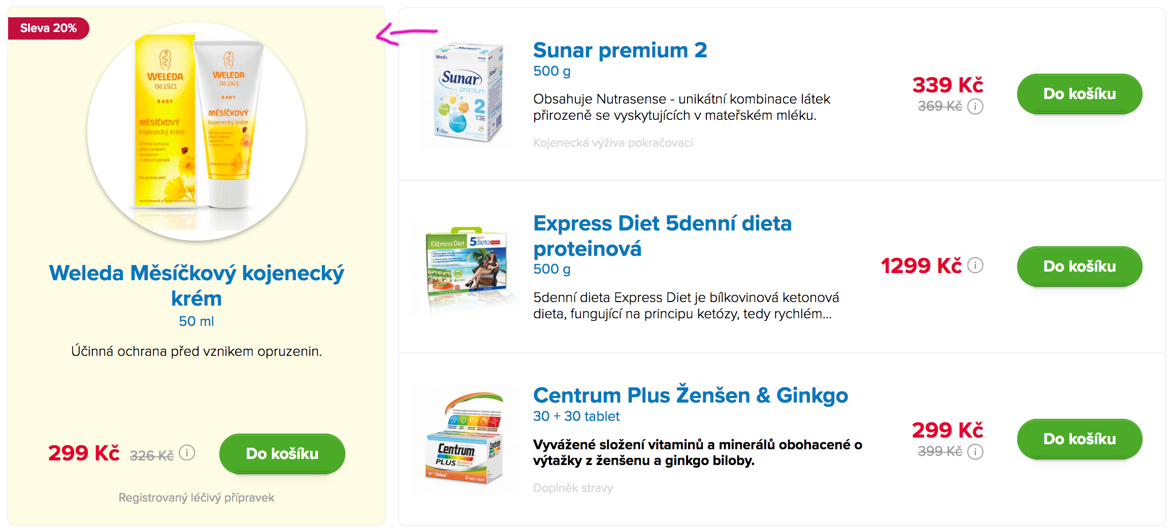
Akce -5%
Alternative are used on product detail pages and should be pointed to #main-product
Dobrý den, pořídila jsem si radu Effaclar od La roche posay na problematickou pleť v tehotenstvi (konkrétně
effaclar mycí gel, effaclar duo a effaclar a.i), dle výrobce lze bezpečně používat v tehotenstvi, nicméně
všimla jsem si, ze tyto produkty obsahují kyselinu salicylovou a na internetu je se dočitam, ze kyselina
salicylova by se v tehotenstvi neměla užívat. Chci se tedy zeptat, kde je pravda a zdali jsou tyto přípravky
bezpečně v tehotenstvi? Děkuji moc a přeji pěkný den.
Na dotaz odpovídá:
Mgr. Daniela Vondráčková Těhotenství, péče o děti
Dobrý den, ano, kyselina salicylová se obecně v těhotenství nedoporučuje, ale když výrobce vysloveně uvádí, že
je koncentrace kyseliny v produktu bezpečná, tak nemějte obavy, její vliv na vývoj embrya bude v tomto případě
zanedbatelný. Loučí se Daniela
Health is the ability of a biological system to acquire, convert, allocate, distribute, and utilize energy
sustainably. The World Health Organization (WHO) defined human health in a broader sense in its 1948
constitution as "a state of complete physical, mental and social well-being and not merely the absence of
disease or infirmity." This definition has been subject to controversy, in particular as lacking operational
value, the ambiguity in developing cohesive health strategies and because of the problem created by use of
the word "complete", which makes it practically impossible to achieve.
Health is the ability of a biological system to acquire, convert, allocate, distribute, and utilize energy
sustainably. The World Health Organization (WHO) defined human health in a broader sense …
Health is the ability of a biological system to acquire, convert, allocate, distribute, and utilize energy
sustainably. The World Health Organization (WHO) defined human health in a broader sense in its 1948
constitution as "a state of complete physical, mental and social well-being and not merely the absence of
disease or infirmity." This definition has been subject to controversy, in particular as lacking operational
value, the ambiguity in developing cohesive health strategies and because of the problem created by use of
the word "complete", which makes it practically impossible to achieve.
Dávkování
Dospělí a dospívající od 14 let užívají 1x denně 1 šumivou tabletu. Mladším 14 let se přípravek vzhledem k
množství léčivé látky v šumivé tabletě nepodává.
Upozornění
Přípravek ACC LONG obsahuje sodík a laktózu. Nutno vzít v úvahu u pacientů na dietě s nízkým obsahem sodíku
a při nesnášenlivosti některých cukrů.
In this component is add css properties for picture and his animation.
This component include two content blocks with text and button.
When you need, you can use just 1 text block.
Už jste slyšeli o naší nové trvalé odměně Karty výhod Dr.Max? Nyní máte trvale 5% slevu z doplatku na
veškerou hormonální antikoncepci, tak nezapomeňte využít maximum výhod, které Vám Karta výhod Dr.Max nabízí.
Těšíme se na Vás!
Tuky naše tělo nezbytně potřebuje. Jsou základními stavebními součástmi každé naší buňky, jsou potřebné pro
správnou funkci mozku a znamenají pro nás i bohatou zásobárnu energie.
Už jste slyšeli o naší nové trvalé odměně Karty výhod Dr.Max? Nyní máte trvale 5% slevu z doplatku na
veškerou hormonální antikoncepci, tak nezapomeňte využít maximum výhod, které Vám Karta výhod Dr.Max nabízí.
Těšíme se na Vás!
Rozšiřujeme pro Vás i online informační servis v oblasti odborné péče o diabetu. Pokud máte ke své Kartě výhod
Dr.Max přiřazený email, tak můžete získávat pravidelný vzdělávací email.
Je tu únor a s ním i období chřipkových epidemií. Chřipka není jen banální nachlazení. Kromě rýmy, kašle či
bolesti v krku jsou hlavními příznaky horečka, zimnice a bolesti svalů, kloubů a hlavy. K tomu se přidává
velká únava.
Cena za 1 ks se slevovým kuponem.
(100 ml = 293,38 Kč; 1 tob = 6,65 Kč)
Platnost kuponu od 8. 1. do 31. 1. 2018 nebo do vyprodání zásob. Kupon se vztahuje na LIPO C ASKOR 60 měkkých
tobolek a LIPO C ASKOR tekutý lipozomální vitamin C 136 ml. Kupon lze uplatnit v kterékoli kamenné lékárně
Dr.Max v ČR nebo v e-shopu www.drmax.cz.
Error-page with modifikator class "error-page--500".
Centering text and the picture has other css properties.
Omlouváme se, ale naše internetové stránky jsou momentálně nedostupné (500)
Právě probíhá přechod na vyšší verzi systému, budeme zpět za několik minut
V případě dotazů můžete kontaktovat naši zákaznickou linku e-mailem na info@drmax.cz
a nebo telefonicky na 516 770 100
Děkujeme za pochopení, Váš tým Dr.Max
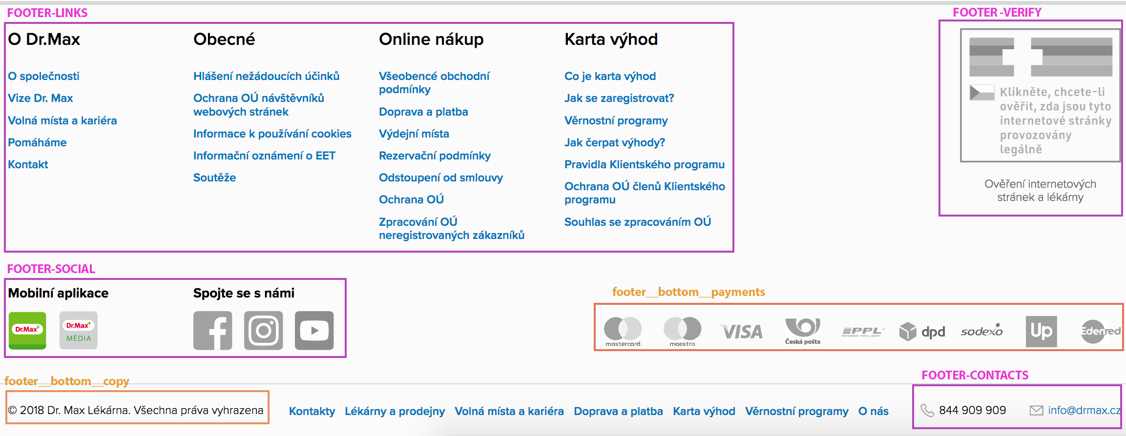
Plastová karta slouží k identifikaci zákazníka jako člena klientského programu.
Plastová karta slouží k identifikaci zákazníka jako člena klientského programu. Plastovou kartu klient
předkládá při nákupu v lékárnách Dr.Max.
Ceny zboží
Plastová karta slouží k identifikaci zákazníka jako člena klientského programu. Plastovou kartu klient
předkládá při nákupu v lékárnách Dr.Max. Na zadní straně karty je uveden čárový kód (třináctimístný). Dále
tzv. KÓD karty (čtyřmístný), který slouží jako PIN pro první registraci do internetového účtu klienta.
FAQ with added modifikator "faq--row".
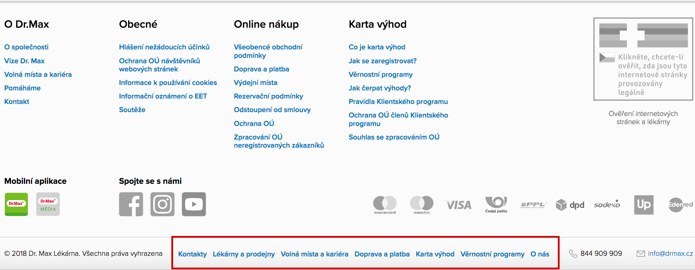
Další kontakty
Plastová karta slouží k identifikaci zákazníka jako člena klientského programu.
Plastová karta slouží k identifikaci zákazníka jako člena klientského programu. Plastovou kartu klient
předkládá při nákupu v lékárnách Dr.Max.
Kontakty na kanceláře
ČESKÁ LÉKÁRNA HOLDING, a.s.
Nové sady 996/25, Staré Brno, 602 00 Brno
IČO: 285 11 298
DIČ: CZ 285 11 298
Společnost je zapsána v OR vedeném Krajským soudem v Brně oddíl B vložka 6919
ČESKÁ LÉKÁRNA HOLDING, a.s.
Florentinum, budova D
Na Florenci 2116/15, 110 00 Praha 1
tel. 222 811 999
Faq in two column. Columns cannot have another sizes.
This component will never wrap in more than 1 line and will be overflowed.
This component is addon for components which items are not wrapped in mobile. This component will add overflow-scroll behavior and will stretch component to full width of screen.
Images are called from CSS code. Change the path in CSS code and commit this change in your work branch (not for static templates). Or you can change its path manual in the <style> inline css.
Code should be inserted in each page, except this ones:
Icon can change its color based on color
css property from css or one of our theme colors.
You can add so many icons, you need. Be careful in adding new icons! Icons are pasted
to web
as inline svg and its code become the part of page html. Icons svg code
should be cleaned before pasting on web.
not to have IDs => may cause in page break with duplicit IDs
not to have <?xml ?>
should have fill="currentColor" attribute
You can edit svg code manually or use this project grunt develop or grunt
build
option, to clean up svg automatically.
To other colored, font-sizes, margin or padding from sides please use bootstrap utilities ,(example: m-2 m-lg-4, text-success, text-body, h1-h6, font-weight-bold...)
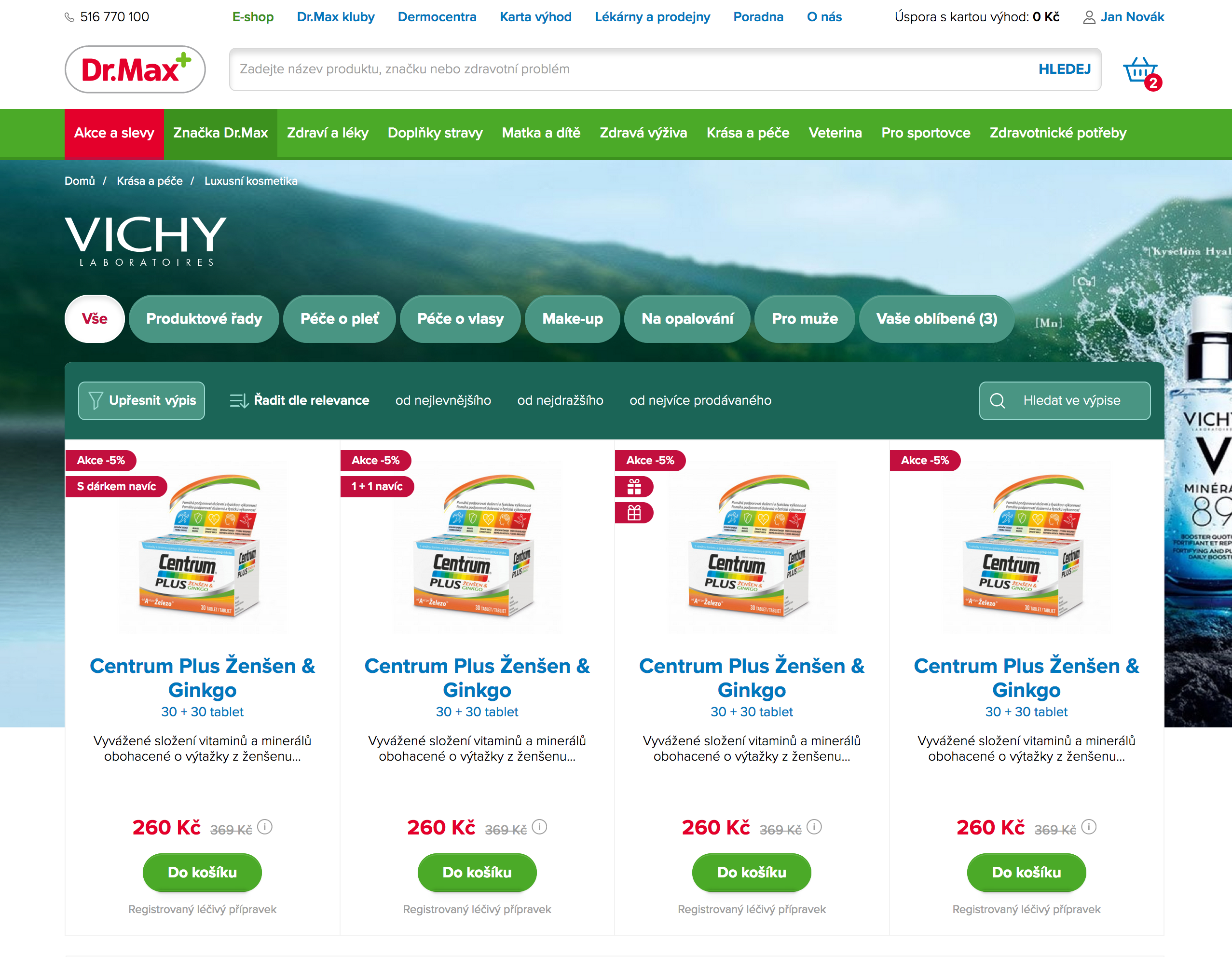
je přírodní síla zrozena v oblasti francouzských vulkánů. Vůbec poprvé laboratoře Vichy dosáhly její výjimečné
89% koncentrace ve spojení s kyselinou hyaluronovou, známým zdrojem přírodní hydratace. Minéral 89 posiluje
funkci kožní bariéry a působí tak protivnějším i vnitřním agresorům jako je znečištění, stres nebo únava. Den
po dni je pleť více hydratovaná, tonizovaná a jasnější...jako kdyby zářila zdravím.
89% Mineralizující termální voda + kyselina hyaluronová
Aplikujte ráno a večer 1-2 pumpičky dle potřeby (lze pouze ráno nebo pouze večer) na čistou pleť ideálně jako
první krok vaší každodenní péče. Může se aplikovat i samostatně.
Počet pacientů, u nichž je zjištěn diabetes, každým rokem roste velkou rychlostí. Jen v České republice žije v
současné době téměř jeden milion diabetiků. Diabetes je onemocnění, které vyžaduje od pacientů velkou kázeň a
zodpovědný přístup. Je totiž nutné dodržovat předepsanou léčbu, dietní a pohybová doporučení. Tím se významně
zvýší úspěšnost léčby. Ať už jste diabetik, nebo má toto onemocnění někdo z Vašich blízkých, věříme, že Dr.Max
DIA se stane rádcem pro snadnější a informovanější život s diabetem. Dr.Max DIA může platit pro každého
držitele Karty výhod Dr.Max.
Suchá, mastná, smíšená? Vrásky nebo pigmentové skvrny? Jakou pleť vlastně máte? Přijďte na diagnostiku pleti
do našich Dermocenter a zjistěte pravdu o své vlastní pleti.
Poradenství v péči o pleť
Vyzkoušejte si naši dermokosmetiku doslova na vlastní kůži. Jen tak si budete při nákupu jisti, že přípravek
se snese s vaší pletí, má příjemnou texturu a krásnou vůni.
Short-article in default state and in 2 column.
Image-rounded sizes: xs, sm,lg, xl. To margin or padding from sides please use bootstrap utilities (example: m-2 m-lg-4)
Na Facebooku pro vás vymýšlíme super soutěže, dozvíte se zde všechny důležité informace o lékárnách, novinkách v
našem sortimentu, ale také akcích na našem eshopu. Připojte se k nám!
Oficiální Instagramový účet lékáren Dr. Max. Těšit se můžete nejen na trendy v oblasti dermokosmetiky a zdraví,
ale také na soutěže, tipy nebo fotky z akcí.
Naše expertky Kateřinu a Báru spojuje jedno kouzelné slovo: dermokosmetika. Dívejte se na svoji pleť z více
úhlů
pohledu a navštivte místo, kde krása potkává zdraví.
Be carefull of using custom colors. This feature is supported in every modern browser but not in IE.
But dont worry. Its just a color.. Component is not broken there.
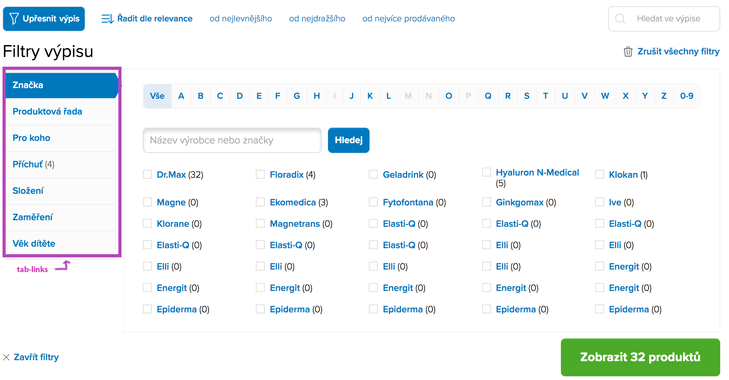
This component is created with bootstrap component (nav, nav-link) but we was need have changed active state with we created a new component "tab-links".
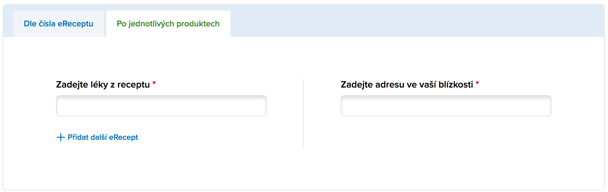
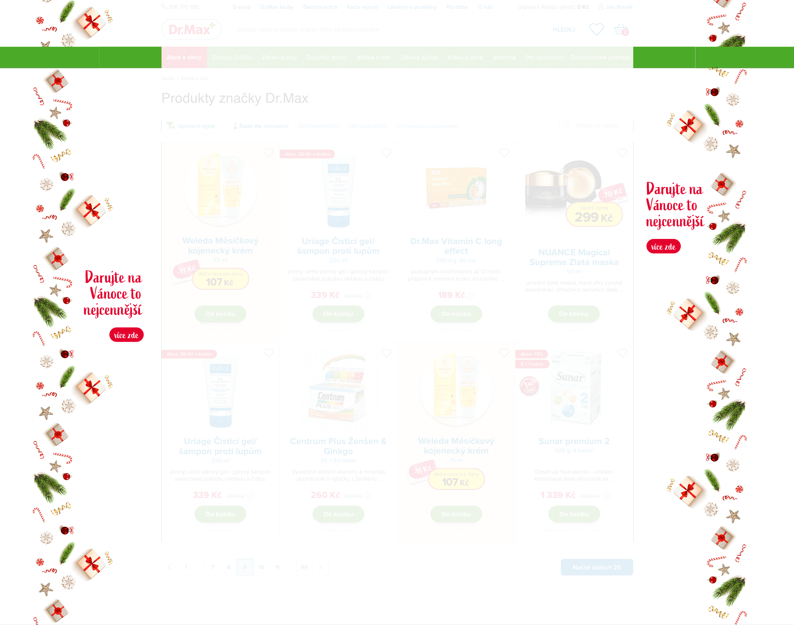
This component is part of filtering. For example, you can find it on this page "listing-simple" after click on the button "refine listing".
Health is the ability of a biological system to acquire, convert, allocate, distribute, and utilize energy
sustainably. The World Health Organization (WHO) defined human health in a broader sense in its 1948
constitution as "a state of complete physical, mental and social well-being and not merely the absence of
disease or infirmity." This definition has been subject to controversy, in particular as lacking operational
value, the ambiguity in developing cohesive health strategies and because of the problem created by use of
the word "complete", which makes it practically impossible to achieve.
Health is the ability of a biological system to acquire, convert, allocate, distribute, and utilize energy
sustainably. The World Health Organization (WHO) defined human health in a broader sense in its 1948
constitution as "a state of complete physical, mental and social well-being and not merely the absence of
disease or infirmity."
Health is the ability of a biological system to acquire, convert, allocate, distribute, and utilize energy
sustainably. The World Health Organization (WHO) defined human health in a broader sense in its 1948
constitution as "a state of complete physical, mental and social well-being and not merely the absence of
disease or infirmity." This definition has been subject to controversy, in particular as lacking operational
value, the ambiguity in developing cohesive health strategies and because of the problem created by use of
the word "complete", which makes it practically impossible to achieve.
Health is the ability of a biological system to acquire, convert, allocate, distribute, and utilize energy
sustainably. The World Health Organization (WHO) defined human health in a broader sense in its 1948
constitution as "a state of complete physical, mental and social well-being and not merely the absence of
disease or infirmity."
It is possible to insert various content, not only text content, into the "card" component. Such as articles, categories, products, etc.
On this page "listing-categories-with-tabs" we can see various content on the page. Or product detail page.
Tags can be used in all components. They are used, for example, in products. articles.
To other backgrounds, margin from sides please use bootstrap utilities ,(example: m-2 m-lg-4, h4, h5, h6..., justify-content-start, justify-content-center)
1.1. Provozovatelem internetového obchodu umístěného na internetové adrese www.drmax.cz je ČESKÁ LÉKÁRNA
HOLDING, a.s., se sídlem Nové sady 996/25, Staré Brno, 602 00 Brno, IČ: 28511298, DIČ: CZ28511298, zapsaná v
obchodním rejstříku vedeném Krajským soudem v Brně, oddíl B, vložka 6919 (dále jen „prodávající“).
Kontaktní údaje prodávajícího:
a) doručovací adresa: Dr.Max Lékárna, Košuličova 629/10, 619 00 Brno,
b) telefon: +420 734 860 262 a +420 547 210 901
c) e-mail: eshop@drmax.cz
Horečka je zvýšená tělesná teplota. Samotná není nemoc, ale značí, že se něco děje s naším imunitním
systémem.
Dětské nemoci
Horečka
Bolest
.text-primary
.text-secondary
.text-success
.text-danger
.text-warning
TEXT WITH ADDED CLASS "TEXT--COLUMN"
Přední značka v péči o pokožku a celé tělo. Vichy patří mezi světově rozšířené značky. Její počátky spadají do
roku 1931, kde byla společnost založena ve francouzském městě Vichy, po kterém převzala i svůj název. Termální
lázeňská mineralizující voda z horkých pramenů tohoto města je jediným zdrojem vodních bází, které jsou ve
formulích výrobků využity.
Péče o tělo, pleť i vlasy
Termální voda dokáže divy. Vyzkoušejte si výrobky Vichy doslova na vlastní kůži. Vyberte si z bohaté nabídky
produktů podle svého typu pleti ty, které vám nejlépe vyhovují a pomůžou pleť hydratovat a zbavit nedokonalostí.
Již po několika týdnech používání si všimnete příznivých změn.
Ochrana pro muže
Samozřejmostí je, že mužská pokožka je stejně citlivá a náchylná k podráždění a poškození jako kůže u žen.
Chraňte ji pravidelným užíváním výrobků z řady Vichy HOMME. Najdete zde produkty vhodné pro hydratační péči,
čisticí péči i přípravky usnadňující holení a zmírňující podráždění pleti po holení.
Termální mineralizující voda Vichy
Přípravky Vichy jsou obohaceny o přírodou vytvořenou termální vodu, která v sobě ukrývá 15 vzácných blahodárných
minerálů. Ty zajišťují, že pravidelným používáním těchto produktů obnovíte přirozenou sílu a pružnost pokožky a
přivedete ji zpět do rovnováhy, aby lépe odolávala nepříznivým vlivům počasí nebo ovzduší a rychleji se
regenerovala.
TITLE h1
TITLE h2
TITLE h3
TITLE h4
TITLE h5
TITLE h6
SMALL TEXT - Lorem ipsum dolor sit amet, consectetuer adipiscing elit. Donec iaculis gravida nulla. Proin pede metus,
vulputate nec, fermentum fringilla, vehicula vitae, justo. Aliquam erat volutpat. Ut tempus
purus at lorem. Nam
Do 38 °C není nutné teplotu snižovat
Nad 38 °C užijte lék na snížení teploty
Užití léků na snížení teploty je pro plod menší riziko, než horečka
Užívejte je ale jen krátkodobě a v doporučeném dávkování
Co můžete dělat bez léků
Doplňujte neustále po lžičkách tekutiny.
Vhodné nápoje jsou voda a čaj s hroznovým cukrem.
Držte dítě v posteli, po poklesu teploty může vykonávat klidné činnosti.
Hodně větrejte.
Přikryjte dítě lehkou přikrývkou.
Zkuste zábaly, omývání žínkou, sprchování.
Not only text content but also buttons are inserted into the text component.
To margin or padding from sides please use bootstrap utilities (example: m-2 m-lg-4, justify-content-start, pt-5, text-success, h2...)
We can include this component for example:
div, a, table (tr,td,th), row (col), form, input, h1-h6, ul,ol, p, small, button, img, strong, b, br, hr, i, u, dl (dt, dd)


 -70 Kč


